ART NOTES

Getaway places called Haarlem (away from the touristy and the obvious!)

On the last day but one of this wonderful holiday we took a stroll around Amsterdam, visited the main shopping areas around Amsterdam Central, saw the beautiful Basilica of St Nicholas, did a bit of the usual tourist stuff and had some typical Dutch food in the Cafe del Mondo, Nieuwmarkt, before meeting my friend Meriem at a very fancy hotel bar, the Hoxton Amsterdam.. It was fun indeed to spend some girly time with people I’m fond of, especially as we helped her to get her papers translated and stamped legally back in 2018. She’s doing so well in Amsterdam that it means a lot to me.

After that we went back to the hotel trying to figure out what to do on the last day. Some American tourists had recommended Keukenhof, the sublime tulip gardens just 40 km away from Amsterdam… but one thing my mum and I aren’t keen on doing is following the herd, so we opted for another kind of quick trip also away from the capital city and hopped onto a train bound for Haarlem!!


A brief selection of pictures taken in Haarlem, a cute city only 20 minutes away from Amsterdam by train.

And guess what there is in Haarlem to see? If you’ve read my previous posts you have probably learnt about another less well known painter called Frans Hals, and yes, there’s an amazing museum in Haarlem showing not only his work but that of many other well known painters any art lover should see. 

So we walked out of the train station, we bumped into a sculpture honouring a Dutch traditional couple… and then on to the main road that leads on to the Central square where The St Bavo Church is located, a massive building that serves as a compass 🧭 to those who usually get lost in new cities. We walked along some canals, saw Adrian’s Windmill (a hotspot for visitors here), strolled around some more cute streets lined with flowers, mainly tulips as the spring season is at its best at the beginning of May.

My mum, Rose, is very keen on Frans Hals so there was no other option than to visit his museum and after a short break for an ice cream at Gelateria Bartoli which is worth mentioning… we set off on foot for this unique museum, located in Groot Heiligland Street, maybe a 10 minutes walk from St Bavo. Haarlem is so quiet in comparison to Amsterdam: it’s lovely to walk around with less bicycles (and occasionally aggressive drivers who won’t stop when they see you, but grumble instead … sometimes it’s not nice being a tourist but this is something every visitor must bear in mind!).

Once you enter the museum, your first stop is to leave all your belongings at the reception desk in order to enjoy the artworks without harming them if you accidentally come too close or touch them.

I have selected this painting of a supposedly pregnant woman with a priest that is testing her pregnancy by touching her breast, in an aim to see if milk comes out.. something that wouldn’t be admissible these days right?

The museum is laid out in a very different way; it’s not presented in a chronological order but themed instead. So in the same room you can find portraits done in the seventeenth century by Frans Hals and his contemporaries, along with others of contemporary art done in the XXth century.

You can compare and realise how painting techniques have evolved from being a way to portray others who wanted to make their mark in history, before the camera was invented, beside other canvases done more recently that go beyond just replicating reality to interpreting what an artist sees with his or her own personal touch. 
I personally like Jupiter, as a planet and as a mythological figure, that was depicted by Nicolaes Berghem in 1658. Another classic worth learning about.

While walking through this must see museum I had plenty of time to think about Frans Hals and compare him to our Spanish master, Velazquez. They both accomplished great works (huge canvases), commissioned by others. Frans has a set of marvellous portraits that show at least 20 men on each canvas, men that belonged to the St George (Joris) Militia Company, the Civic Guard of Haarlem. He started painting them in 1616, portraying all the members including himself using oil on canvas at a stage when Frans Hals was already a recognised artist and also a member of the Civic Guard. His technique and talent were at their best at this time. There are at least 8 mega canvases in the museum, do check them out, and witness their greatness as they are the very best of the Dutch Golden Age.

I have to mention this Pieter Brueghel marvellous canvas named as ‘Proverbs’. An authentic jewel that is so much fun to analyse, everyone or everything makes sense and has been painted after an old fashioned proverb. It does explain and teach a very good life lesson. 

As we continued our visit, there were various group paintings of women as well, The  Regentesses of the St Elisabeth or Groote Hospital, a painting that was donated to the museum in 2011 and is valued at over 100 million euros.. what a nice gift to receive that is!

The donation included other works by Vespronck or Hals son, Dirck, that originally belonged to the Elisabeth Van Thuringen fund that had them until then. Those can also be seen here, in addition to a very interesting map that tells you how art masters influenced their students. By the way, Elisabeth Van Thuringen was an Austrian princess who became a Saint in the thirteenth century. How the artworks have ended being part of her fund is something I have to investigate thoroughly before talking about it here. So I’ll leave that for another post.

Frans Hals painted well into his old age and his last works betray his elderly years in the form of a less perfect execution. His final paintings reflect how his health was deteriorating and it is well known that he was much critised for this. Nevertheless, this doesn’t mean that his whole career should not be considered as what it was – outstanding.

There were more rooms to see that we had to skip through because there was a flight to catch in Amsterdam that night, landscapes and other mesmerising modern artworks I obviously recommend you to see.

Back in Madrid I realise how great this trip has been and how much there’s to learn if you are an eager person.


Do visit this quaint town if you have the chance. 

After a wonderful break, no better plan than two precious tickets to see Vermeer!!

It was an arduous quest but thanks to the massive response of people who were interested in visiting this first Vermeer exhibition at the Rijksmuseum, the museum decided to open its doors until late, opening a window of opportunity for those like my mum and me who were unable to purchase tickets the first time round as they sold out in 48 hours. So yes, that’s the greatness of a painter like Vermeer!

Back inside the Rijksmuseum, in an area only allowed for us as the rest of the museum closes at 17.00, we followed the signs indicating the way to the exhibition. Only art lovers like us will understand what it means to be able to see nearly all of Vermeer’s artworks, a painter born in Delft in late October 1632, meaning that he created his art during the Baroque period.

Like many painters of the time Vermeer began by painting biblical scenes. This was very common as not only was it a permitted topic that most of the public would enjoy, but also churches needed artworks that would pass on a Christian message to all their visitors or members. 

Of particular interest are two paintings of exterior views. The larger one is a mesmerising canvas that portrays the city of Delft, seen from the south and showing the ‘Niewe Kerk’, the new church built in the 14th century and originally named after St Ursula. The canvas is divided into four sections, the quay, the river, the town and layers of clouds on top. 

Vermeer painted the smaller city view from his own house. Something that I had learned before this trip is that Vermeer was a painter of interiors. He is well known for his mastery of the use of light in order to enhance volumes and give more importance to the person(s) featured in the painting.

Following the order of display, we came to The Procuress, another work that struck me as being very special, a gem of a painting with hidden messages, also said to contain a self portrait. This painting shows a young lady wearing a yellow robe, surrounded by people who are supposedly trading with her, in every sense of the word. She has her hand open waiting to receive a coin, the man behind her is both holding the payment and his left hand is touching her breast. The entire scene is quite disturbing: the girl seems be impressed by the money, and what appears to be water in the glass she is holding is probably something stronger due to her red cheeks. The man who is looking at us from the left is supposed to be Vermeer himself, one of the few self portraits there might be, but it has not been confirmed. He holds some kind of present for the young lady whose future is being decided between the others, including an old woman who stares at her probably hoping to get something out of this dark deal.

Something we particularly liked, often repeated in many of Vermeer’s paintings, are the coloured carpets, used in many paintings as a table cloth or curtains, also reflecting the light and making his work utterly special.

Vermeer was a true creator. He planned his work thoughtfully, selecting all the items included in the canvases to make them seem right; nothing was there without a purpose.

Next was The Milkmaid. Although we didn’t make it before The Girl with the Pearl Earring was returned to the Mauritshuis, another jewel of a museum located in The Hague, we got to see this other iconic piece that I really enjoyed, the light again coming from the window on the left and falling directly on the girls face, the milk pouring out of the jar, that precise moment that makes the painting come to life. It is a simple triangular scene, but here the statement ‘less is more’ really does apply.

Nothing else is required and all the simplicity that makes us stare at the table that is shown in the lower triangle is the result of dividing the canvas diagonally. All the important objects are dynamically presented: some bread painted in a very impressionist way, a blue studded beer jug just behind the brown-yellowish bread, making this contrast stand out.

The same combination is used on the milkmaid’s costume, a sparkling yellow top with a colourful blue skirt, a blue tone that was expensive to buy at the time because the pigment was extracted from Lapis lazuli coming from Afghanistan.

From then on, Vermeer seems to focus on painting young woman in different aspects of life: the rich, embellished with expensive garments, playing instruments only reserved to those who could pay for tuition, those whose family was wealthy, surrounded by other women who would care for them, working as maids or seamstresses, delivering or waiting for love letters… all of them recognisable due to the setting, the window on the left, the light falling on the person or object that Vermeer wanted the viewer to focus on… rich girls who were allowed to smile and show their teeth, wearing colourful clothes and pearl earrings that make them distinctive.

Being able to see most of Vermeer’s paintings has made me witness how he evolved, how his technique became perfect and how he tried different settings or views although he barely left his studio.

Here we can see two examples of Love letters, one of his favourite topics, something fashionable those days.

The next painting I’d like to comment on is the one that is painted from the closet, as if the painter was watching the scene hidden inside, something different for a change in his artworks. This painting known as The Love Letter is one of a kind, the point of view is new, the light still falls on the subjects but we have to imagine the window this time… the subjects stand out in the middle, our sight goes in the direction of a young woman playing a guitar, holding a letter that her maid has just given to her. They both gaze at each other while we look at the interiors of the closet and the room full of cleaning items, a broomstick, some shoes, a basket, as if the maid had rushed to the door leaving everything behind to deliver the letter as quickly as possible. In the background we can see a fireplace, black and white tiled floors in perspective, some paintings that tell us about the lady’s social position, delicate oriental cloths that were probably fashionable and expensive.

I could speak for hours, analysing every single art work here, a wide selection brought from many museums all over the world, as there were many to see but I’ll just comment a bit more on my favourite one, a decision that has been hard to take. However, The Glass of Wine made me laugh and it truly deserves a pole position here.

Also known as Lady Drinking and a Gentleman, nowadays this painting is located in the Gemaldegalerie in Berlin. It was created in 1660 and it’s inspired by the Delft school developed by Pieter de Hooch during those years. The setting in Vermeer’s paintings is clearly defined by the space created by a spectacular stained glass window located to the left, with a hand painted glass that seems appears to be a coat of arms. The light that falls on the glass of wine that this lady is drinking, entirely covering her face, also enhances the white cap she’s wearing to cover her hair.

The handsome man has an intense look, as he waits for her to finish drinking and probably start some kind of courtship. He is still wearing his hat, because as the art historian Timothy Brooks has said, ‘a courting man never went hatless’, and wearing a hat at the time also meant authority and male supremacy in the Netherlands. So well to do men kept them on at all times, in comparison to the lower classes that had to do the opposite.

The lady’s red dress shines brightly to make the best impression on this man and perhaps it was her best dress due to the golden stripes that stand out from the rest of the material.


The checkered floors direct the perspective and our eyes focus straight on to the main scene, making other objects appear as mere decoration

It was an exhausting day but learning about the unique artworks that have been brought to the Rijksmuseum was an exceptional experience I never imagined living alongside my wonderful mum.

The exhibition is on until the 4th of June but ticket purchase now is probably extremely expensive and almost impossible.

More info here! https://www.rijksmuseum.nl/en/whats-on/exhibitions/vermeer

A day in The Rijksmuseum!

Finally, the day came for us to accomplish our mission at the Rijksmuseum!

But of course, we, the Paynters don’t like easy things, we like doing things from the heart and thoroughly! So before checking out Vermeer and his awesome selection of artworks that have taken my mum and I to Amsterdam, we started a tour of the whole collection on display here, a large collection that shows artworks dating back to the 15th century, specially Christian art, as it was the main medium of expression allowed in those days.

It was fun to discover paintings with the same face repeatedly on different figures, and guess what? Yes, I was told off for pointing out to my mum that the same face was all over the painting, without touching it, but of course the museum attendant had to do her job and told me not to get so close. As an artist, I’ve never touched a painting or would do anything that damaged an object that needs special conditions to last long for future generations to see.

The following artwork that I have added upon request after receiving a message from my mum, Rose, who was struck by the piece when she saw it.

Literally, her words have been as follows: ‘I’m impressed by all the photos you took at the Rijksmuseum. One painting I liked a lot is The Holy Kinship (El Parentesco Santo) c. 1495 by the workshop of painter Geertgen Tot Sint Jans. It is at the end of the first hall we visited before you turn round to go back down the other side. I like the contrast between the intricate perspective of the church and the flat doll-like faces of the holy family. Perhaps you could include it in your blog? Here is a photo’. 

And after lots of different religious paintings, sculptures or even a chess board with the emperor Charles V of Spain and Lord of the Netherlands as main black King, or prayer nuts (tiny wooden carved scenes from the bible), a collection of things so beautiful and incredible to admire. It makes me feel blessed, being able to fly out with my mum and spend a week witnessing the most amazing things that man has left behind. And it makes me reflect on what to do, how I should proceed in my own career in order to release a not only sustainable but appealing footprint through my artwork.

I must say that I loved the Rijksmuseum. I thought that the way it is presented to the visitors is quite clever and yes, they have included quite a few engravings and paintings done by women! This is the  kind of statement that shouldn’t have to be made; it should be natural to find artworks without having to go crazy about gender, but sadly, as with nearly everything until the 20th century, only men were entitled to do or pursue a career. Or the only option was to learn it from your Dad, as Artemisia Gentileschi did or the example found here, Diana Mantuana also known as Diana Scultori. She was the only daughter of Giovanni Battista Scultori and sister of Adamo Scultori, who probably taught her the ins and outs of drawing and engraving. As we learned at the University some years ago, people in ancient cultures weren’t supposed to do or learn anything that their father hadn’t done or studied, or to be more successful than him in a job that he’d taught you. This constraint offered learning opportunities but lacked creativity, making jobs only accessible to those who could be taught by a master

Barbara van den Broeck is another example of a female artist who was able to develop thanks to being the daughter of Crispin van den Broeck. There are many examples of awesome masters who have grown up surrounded by art, whose parents have been artists themselves, a fact that is not only helpful due to the amount of work done ahead, but also because it must be easier to understand what it really means to be an artist. I’m not saying it is unfair but it does help. A bit like me, having an English mother… it does seem to be an advantage but you still have to prove you have the knowledge.

In the following gallery you will see a few selected artworks that I found quite meaningful.

Back to the Rijksmuseum, I’ll skip many epic artworks so I can talk about my favourite artist, the one I admire the most, not the most colourful one but I love the way his subjects gaze back at the audience: the amazing Rembrandt and his most powerful artwork, The Night Watch. I have to mention that this huge canvas is currently protected from AC damage, they are studying how having so many people around it and the use of AC has unfortunately caused deterioration to the materials used. It makes me think about the Prado museum and how well designed it is, as paintings like Las Meninas do get many visitors but it still seems in perfect shape.

After that, we strolled around the main hall known as the Gallery of Honour, where the best 17th century Dutch painters are showcased, from Frans Hals, the female painter (yes!) Rachel Ruysch’s delicate flower bouquets, Jan Asselijn, and a huge Threatened Swan,  hyper real still life paintings by Pieter Claesz or William Claesz Heda.

I have to mention Vespronck’s family portraits,  that give us detailed information of what the fashion was like during those years, fine lace, embroidery and jewels embellished the most sophisticated high society people.

While we waited for our date with Vermeer in the evening, we stumbled upon some of his peers, Pieter de Hooch as the main example. His artworks work portrayed home interiors, domestic scenes, children, servants, dogs, mastering perspective using tiled floors and several rooms in a row towards the back part of the main scene. They serve well as examples of what life was like then although the quality isn’t as good as Vermeer’s, who mastered light and feminine anatomy in a perfect way!

The rest of the visit took us to Napoleon, French influence in the Netherlands, a painting by Goya, a huge diamond that was seized from the Kalimantan’s, lots of antique furniture, sculptures..

And most importantly, a whole room for female painters… names such as Barbara Van Houten, Bramine Hubrecht, Therese Schwartze, Betsy Westendorp-Osleck, Julia Margaret Cameron or Marie Constantine Bashkirtseff to mention just a few of them. It was a happy surprise as you don’t tend to find many female artists before the 20th century. Any job before that time seemed to be reserved only for men, meaning that women were only entitled to marry and give birth to children, which of course is always a good option but there are many other things in life we can do!

We left the museum for a bit of leg stretching and a delicious meal beside the Spiegelgracht canal at a very nice restaurant called Hansel And Gretel 🤤

Loving Van Gogh

On our second day in Amsterdam we had made no plans and we fortunately ended  up spending most of the day inside Van Gogh’s Museum!!

I do advise to buy tickets before arriving, do plan your trip ahead in order to avoid paying extra expenses.. however the way, we arrived around 10am and left when it was closing.. a very long day surrounded by beautiful artworks and some historical facts that I knew after reading Letters to Theo, a book were Vincent writes about feelings and art, his troubles or his artwork..

The gallery of pictures above shows a selection of his early works, life and death in the shape of a sculpture by of a peasant feeding his baby, a cool skull smoking (not something I advise but the message is quite clear!), a few still life’s and landscapes that start to show that new impressionist wave so characteristic of the late XIX century.

A fact that is clear is that Van Gogh was extremely talente since the beginning but unfortunately had little money to pay his models and ended up doing many self portraits, using both sides of the canvases, that are exhibited at the Museum (and yes, you can check both sides!).

I learnt that Van Gogh was a late artist, only believed in trusting his talent at the age of 27, starting then a marvellous production inspired by local people, farmers and peasants, all in all, people that are strongly attached to earth and nature. Vincent did paint many landscapes, trees, flowers, famous sunflowers.. being spiritual and depicting real things that happened to be around.. he was opposed to his friend Paul Gauguin who was more prone to the use of imagination, and creating something new from memory not from what is obviously visible to human eyes.

We got hold of some audio guides for which I have another hint, that is to start from bottom to top, as his works get better as he grew older and mastered his own unique technique.

I found this technique very interesting and correlated to the scientific theory of light that was firstly discovered by Newton, proven later by Maxwell (about the nature of light) or Mayer (chromatic circle that divides colours into primary and secondary), facts that Vincent Van Gogh learned and tested on his canvases.  I say canvases but in some cases when he couldn’t afford to pay for a canvas, he would resort to cardboard or even turn previously used canvas round and use the other side. What we call sustainability these days.


He had learnt well about the color theory and was keen on mixing colours no just on the palette but directly when applying brushstrokes. But another fact is that he was addicted to absinthe, a very strong liquor that is said to cause allucinations, allucinations that wouldn’t pair well with other problems related to self esteem.

It must have been hard to live pennyless, alone or in a psychiatric ward due to his health condition. Some of the paintings on display here, were painting during his stay at the St Paul Asylum in Saint Remy, overlooking the view from his room and placing it on the canvas. He had mental problems but that didn’t stop him from pursuing his dream of becoming an artist in the most extraordinary way.


How his life ended is still a bit of a mystery, some believe he committed suicide, some others have discovered that he could have been shot by accident by two teenagers that were covered by Vincent so they wouldn’t have to face going to jail. It’s a shame that his career ended up so abruptly, specially at that moment when he was becoming a true master, had developed a new authentic way to paint and was creating beautiful canvases that would continue to inspire young artists a century and a half later!

If you happen to visit Amsterdam, this museum is a must see!

https://www.vangoghmuseum.nl/nl

At Rembrandt’s Huis

Last week I felt blessed as my mother and I flew out Amsterdam bound!!

And as all great trips are, we started it visiting Rembrandt’s house, the place where he created amazing pieces, his studio, his kitchen, his bedroom.. everything you can imagine regarding a great master that I deeply admire. A person who had a difficult life but instead of embracing darkness, he was driven towards the light of art.

The visit starts inside his kitchen, where along with many cooking utensils you could see a closet that turned out to be a bed! Yes.. a bed, both my mum and I imagined that the maid would sleep there, close to the food and cooking facilities that kept her warm

. As a matter of fact, Rembrandt’s life was quite sad, he lost most of his daughters shortly after birth, a few of them shared the same name, Cornelia van Rijn. The only surviving child was a boy named Titus, who he portrayed and used as a model a few times. 

Even his wife Saskia passed away, something quite unbearable if you have strong feelings towards your loved ones, and in the end Rembrandt ended up marrying his maid.

Back to his ‘Huis’, as you walk up to the upper floors, they seem to unveil more intimate rooms, his office, a reading room full of marvellous paintings that he probably exchanged with other artists of the time, a great time of wealth in the Netherlands to be able to witness and make a statement of, in the shape of great paintings. 

The Night Watch has always been one of my favourites, an awesome artwork that can only be compared to Las Meninas by Velazquez for example. If you wish to visit this piece, it is showcased at the Rijksmuseum, another great museum that deserves another post.. I’ll be writing it shortly! 

This picture gallery shows a bit of what’s to be seen inside Rembrandt’s house, things that struck me as incredible, and allow you to imagine what it would be to be an artist in the 17th century. Grinding pigments, creating his own unique oils, those oils that turned out to be ‘one of a kind’ masterpieces. His studio, his easels, are found on the upper floors, the rooms that have the best light, a basic need for all artists, never minding what style you are more inclined to paint.

Last of the visit but not least, an interactive corner where everyone is invited to draw and of course I took action and proved the drawing skills I’ve developed since I was a child.  Being an INFJ has its advantages, I might not enjoy talking to a huge crowd but I do quite well when an activity gets creative.

Introducing Santos Sainz Martin..

…a smooth cocktail of Surrealism with a slight Edward Hopper gist!

As an art lover, I do spent time around other artists, artists like Santos Sainz Martin who had an amazing exhibition at Wilko Gallery last February.. I know I should have posted this note at the time but life has been hectic lately, I was concentrating on other projects, which meant leaving the website a bit aside. Now that some of them are over, I can share some of the shows I have found deeply moving or interesting.. sometimes it can be hard, however Santos despite being 86 years old, is a true master worth checking out..  

and as said previously, if you happen to fall in love with his work, Wilko at Wilko Art Gallery Calle Doctor Piga, 11 is the man to contact in order to acquire a beautiful piece of art.

Some of the best paintings are here, along with many drawings, oil paintings are his core speciality.

PINTA Y CATA

Firstly,  I must apologise because I haven’t been productive with my art texts lately, although I have visited some exhibitions and I should have recommended them.. specially the Carmen Thyssen collection in the city of Malaga, in Andalusía, that I visited last may.

However, I’m back on track with a new exciting project that I joined last year called Pinta y Cata where I’m teaching how to replicate one of my artworks while a very good wine master tells you about the ins and outs of three different wines.

You can hire our services for private parties or events.

I strongly recommend the experience, not only because you will have fun painting but because of the quality of the wines offered and the tapas which are included as well.

Thanks Petra for counting me in for this exciting project!!!🥰

Some of the attendants to the first opening day! 

Feed back has been amazing and we are hoping to deliver the very best in the following upcoming dates that take place every fortnight, next Sunday will be the next  chance to join!

Check this video to see the atmosphere 👨🏼‍🎨🧑‍🎨👩🏼‍🎨

Here you can find some examples of the art lesson, where I explain my passion and drive for art apart from teaching the techniques.

Hoping to see you soon, do join us every fortnight at La Jauria, calle Colón 10, Malasaña.

Starting time is 5pm.
Get ready to unleash your creative mind!

THYSSEN BORNEMIZSA MUSEUM

‘I’ve selected the following artwork to start this article, known as The Fair Captive as one of my favorites because I love the idea of painting a painting which appears inside of the same piece. Something I consider remarkable at that stage of history. I also believe that his piece is one of sublime beauty. 

Well done, Magritte!

Marián Ramírez Paynter

Love the perspective, from the inside out, painted in 1936

First of all, I would like to apologise for not having published any articles since before the summer but I’ve been quite busy and far away from museums all this time.. the truth is that since I’ve returned to the city I’ve been to a couple of exhibitions or places worthwhile mentioning but I don’t always have the time or will to write. However, after bumping into an ex-colleague who said he missed reading my posts I have decided to start taking notes or talking about art again.. I also felt relieved to find out that there are people out there enjoying what I comment on, and this has motivated these reflections on Magritte. I really appreciate my ex-colleague’s words saying that the particular way I write is addictive.

So, on the 26th of October after a first unsuccessful attempt we managed to get tickets and enjoy the works of René Magritte, a Belgian born painter and a contemporary of the Paris-based surrealist artists. His artworks are undoubtedly outstanding, not only because of the intrinsic quality of the paintings but for the originality in the way he approached or looked at interesting things he would represent or consider worth taking the time to capture on a canvas.

The Principle of Pleasure, 1937.

In earlier posts I’ve already commented on surrealism or surrealist artists, as they seem to be in fashion (just like German expressionism is) as most modern art museums have held exhibitions about them and it doesn’t take much effort to realize that it’s been approximately a century since they first emerged so this fact marks an important time to remember them, given the great interest in these kinds of art.

Magritte wasn’t an alien to surrealism, in fact he naturally became a core member of this movement that allowed artists to literally blow their minds in the most introspective ways, more than any of the classic painting techniques. After trying to succeed in Brussels, due to the lack of understanding of his work which since the very beginning was different and unusual, René met Andre Bretón in Paris where they forged a true friendship that laid the principles of surrealism and raised him to the highest level an artist can ever dream of, promoting themes like illusion, magic and dreams.

In the exhibition we can find at the Thyssen Museum, the layout starts with a few black and white pictures that portray people in unique ways, as people who develop as the works progress, representing themselves through movement and painting.

The Therapist, 1937.

Magritte focuses on a very fashionable topic nowadays, trying to keep peace of mind.

As we make our way through the rooms, we discover that part of his artwork in which the artist wants to trick us with the dissociation of images from text or the real meaning of what is represented. Famous sentences such as Ceci n’est pas une pipe, in which what is seen is not what it is, an image of a pipe is not a pipe, it is just a representation, playing with the fact that representation is only pure illusion, but never the object for real, no matter how realistic it may seem.

He plays with the concept of absurdity, with preconceptions out of context, placing objects in unrealistic sizes, rather like Alice in Wonderland, enlarging or shrinking things as he encounters them in life.

Personal Values,  painted in 1951, depicts a critical view of the object and its value, in comparison to the relative value of our values as human beings and what we consider important, consumable or transient elements.

The Waterfall, original oil canvas from 1961, that I trully enjoy.

Probably because everything related to nature deserves to be respected.

Regarding style, there’s a period that needs to be mentioned, the period known as Renoir, that coincides with the German invasion of Belgium when Magritte was back in his home country. What’s interesting about these years relates to colour. We would think that given the circumstances he would use grey or sad tones but unexpectedly he turned to a positive colour palette. In psychology this translates into a cheerful, light, very green landscape and blue skies as a main item, always mixing surrealist strokes or wooden patterns that appear repeatedly in his artwork, overcoming a dark era with light and a different approach.

«The Blank Signature»

The Blank Signature was painted in 1965,  it deserves special emphasis due to the way Magritte  portrays a women riding a horse, in a trompe l’oeil way, playing with the observers way of thinking or looking. It tricks the brain intertwining trees with the horse’s body and the women that seems to be coming out of the tree in a very genuine way. 


Another interesting aspect of Magritte’s work is the overlapping of elements, like a collage, items that fly or bind together making his pieces something from another world, utterly and uniquely special.

The perfect example is the following artwork better known as Delusions of Grandeur, painted in 1948, a painting presenting a female torso that unveils itself in front of a group of clouds and cubes, mixing geometrical shapes in a refreshing way.

Magritte definitely became an art icon, a creative genius who naturally led others in a fashionable movement such as surrealism, due to his incredible ability to paint intelligently in an original and hardworking way, regardless of classic and unsurprising laws, old fashioned ways that are repetitive or copies of something that has already been seen.

The Art of Conversation was painted by Rene Magritte in 1963.

A dreamlike image done on canvas using oil paint.

There’s no doubt that Rene Magritte is considered a genius and art lovers or young learners shouldn’t miss the opportunity to check this out for themselves by visiting his amazing paintings at the Thyssen.


Available until January 2022.


THE PRADO MUSEUM

The Permanent Collection

I’m back again after some days off, and quite honestly, I’ve been pretty exhausted trying to get my future career in place, so sometimes I feel I can’t encompass everything.

So that said, let’s get to the business that brings us here and makes us enjoy this blog, that thing called Art.

It’s been nearly a fortnight since we last visited the Prado Museum, a gem that should make Spaniards feel utterly proud. It’s one of the first museums ever created in the world, dating back to 1819, and the collection to be seen here is without doubt, one of the best, if not the best along with the Uffizi gallery in Florence, The Hermitage in Saint Petersburg, The Louvre in Paris, or the British Museum and the National Gallery in London.


A museum that should be listed as one of the world wonders.

One of the facts that really strikes me as unique here is the size of Velazquez’s paintings, paintings that make us think ‘How long would he take to paint each painting?’ or ‘Would he be assisted by someone else?’ (In my opinion he was probably helped by someone who would make the coloured oils) or ‘What would he talk about with the King?’ during those lengthy painting sessions, sessions that no longer take place due to photography. Velazquez probably had his tricks, he might have painted the face while the King was there, using a model afterwards for the body; not sure about that, I’m only trying to guess.

This is one of the most important rooms in the Prado Museum as it contains part of the most valuable artworks done by Velazquez. 

I was told off by the watchlady in charge (that I’ve erased from the picture with PS), so please, don’t follow my steps and do refrain from taking pictures in the museum. These artworks are unique and they have to be preserved from any kind of damage that cameras could cause. 

A novelty I should comment on regarding the current areas available to wander around is that more rooms have been opened to visitors since the reopening last year. The space which due to COVID was called ‘Reunited’ has been enlarged and should be renamed ‘Reunited with the French’… especially with French painters, as the area that can be seen now shows paintings done by Jean Ranc, Louis-Michel van Loo and his famous painting of Felipe V and his family, and Michel-Ange Houasse. Nearly all of the artworks presented here relate to the Bourbon dynasty.

The artworks here are of great quality, they portray the essence of those years, unstable years marked by the Bourbon reformism that fortunately gave way to the Age of Enlightenment, an era whose purpose was to make a better society, not just a cultured society but a critical one, able to rise above ignorance or vulgarity.

In fact, the first ever dictionary the RAE published in Spain ‘The Dictionary of Authorities’ was dedicated to King Felipe V. It explained ‘the real sense of voices, their nature and quality, with phrases or ways of speaking, proverbs and sayings’, and as mentioned on the book cover, it aimed to create a document that could be a model to the whole country. Anyone who had access to it and could read it would be enlightened by it.

Jean Ranc, Housse or Van Loo might not be the most well known names when we talk about the Prado, but we do have to praise them in terms of the value of their works, how they show us the style of that era, a style that can be seen in the form of jewelry, clothes and the unmistakable white or powdered wigs.

Felipe V, King of Spain. Circa, 1723. Oil on Canvas.

As an anecdote I can tell here, it seems that King Felipe V was not keen on the Alcazar de Madrid, the place where he had to live. He had inherited the Alcazar from the Austrias, and for no apparent reason, during Christmas Eve in 1734 it started to burn, with Jean Ranc for example in it… and as a result the building was destroyed. To its disappearance we have to add the unfortunate loss of more than a thousand art works, of which around 500 had been painted by Velazquez, paintings that  unfortunately won’t be seen anymore.


This fact makes me appreciate greatly the legacy that has been preserved and housed in an amazing space such as the Prado. Once again, I feel proud to be Spanish.

Let’s move on to Goya, and the wing where we can find mesmerizing works from Sorolla, the painter who made beaches look elegant and classy.


The 3rd of May or the ‘Executions’, Goya 1814. Oil on canvas.

I strongly believe that Goya is the father of all photojournalists in Spain, the first to step outside the royal lodgings to paint the real pain, the ugly truth that aristocrats never want to see. He witnessed the Napoleonic Invasion, that made all Spaniards stand together and gave us a reason to unite in the fight for our country and fortunately, thanks to Daoiz or Velarde, was unable to go further. They got as far as the Maravillas neighbourhood (nowadays known as Malasaña), to the ‘Artillery Park’ where the Marqueses del Valle Palace was built (the arch is the only piece left of it), latterly named the Dos de Mayo Square, with a group of sculptures made by Antoni Sola in 1830 as a symbol of honour.

They are great artworks because of the ability to convey the feelings of an era, artworks such as ‘Tres de Mayo de 1808 en Madrid’ where soldiers couldn’t even look at the peasants in the face while killing them or ‘Dos de Mayo’ with its famous ‘Mamelukes’, Egyptian soldiers that were brought to Spain by France, described by Goya as the Tyrant of Europe, and he was truly right there.

The Surrender of Breda. Diego de Velázquez , 1635. Oil on Canvas.

On June 5, 1625 the Dutch governor of Breda, Justinus van Nassau, surrendered the keys of that city to Ambrosio Spínola, the Genoese general commanding the Spanish tercios (a group of soldiers that included pikemen, swordsmen and musketeers) of Flander… (as read on el Prado’s Website).

Pictures are not allowed at El Prado Museum. 

Paintings have to be protected and flash light will damage them, so please do refrain.

Frankly, we went quite late on a Friday evening, taking advantage of the free entrance that the Prado offers from 6pm onwards, after first collecting your tickets at the ticket office. I’m just commenting on this fact because we didn’t have the time to visit much more, but instead we did admire one of the best artworks ever (Meninas do excuse me here but I do consider ‘The surrender of Breda’ as probably the best of them). And I do love the way some of the men portrayed here follow you with their eyes no matter where you’re standing. This is something that has amazed me since I was a kid, something that makes the painting particularly realistic.


The topic here is the handing over of the keys to the city of Breda to the Kingdom of Spain, ruled by King Felipe IV (not in the painting), although the people of Nassau had been fighting for independence for 80 years.


Breda was part of the Kingdom of Nassau and a strategic enclave for Spain’s interests in the Netherlands. To my understanding this piece represents diplomacy, as we can’t see blood everywhere but a peaceful exchange of items, such as the keys to the city. Fortunately, for many years it was hung in The Kingdoms Lounge in the ‘Cason del Buen Retiro’, a place where diplomatic receptions were held as it was one of the most important rooms in the building.


Velazquez would leave a blank space at the lower left-hand side of the painting, a place to sign the artwork once finished but it seems he didn’t find the time to do it in this case.


Finally, our visit reached its end, but we are eagerly planning the next one as we always find the Prado an enjoyable place to learn things.

THYSSEN-BORNEMIZSA MUSEUM

German Expressionism

Last Friday I was able to visit this last exhibition and to be honest, I highly suggest others to check it out, although it might be a bit late as it will only be available until next Sunday, the 14th. In any case, better late than never!

The reasons why I thought it was very interesting, not just a mere walk along canvases but because it also presents the figure of Baron Hans Heinrich Thyssen-Bornemizsa, a german art collector that gives name to the museum itself and that spent a great part of his life finding out the undoubtable value of a wide selection of artists from different parts of the world.

He definitely helped shape the way in which we understand art today.

Ernst Ludwig Kirchner. Nude with Bent Leg (1921-1923).

The art works presented here by the curator Paloma Alarcó were created during the first two quarters of the twentieth century. They are the visual outcome of the influence inflicted into expressionist artists by late post impressionists such as Van Gogh, outstanding Dutch painter named for his unique bold and emotional strokes or, Paul Gauguin, who, at the age of 35, decided to give up on his family and his broker position to start traveling the world to places like Tahiti in order to pursue his painting dream as opposed to the kind of life society had imagined he was supposed to live.

Both are magnificent masters of colour, colours in their primary (yellow, magenta or cian) or even secondary but in a pure shape, as they shine out, seem more lively or simply, more explosive.

By reducing the means, the message seems clearer. At the same time the composition rules seem broken, but they show more angles and there’s not only one admissible way.

Ludwig Meidner. The Corner House or Villa Kochman, Dresden, 1913.

In the art world, rules are meant to be broken, that’s why we call it art, because it makes us look beyond.

That’s why expressionism was defined under the following precepts:

 «An Expressionist wishes, above all, to express himself… (an Expressionist rejects) immediate perception and builds on more complex psychic structures… Impressions and mental images that pass through … people’s soul as through a filter which rids them of all substantial accretions to produce their clear essence […and] are assimilated and condense into more general forms, into types, which he transcribes through simple short-hand formulae and symbols.»- Wikipedia.

It’s the creation of a new movement in opposition to the impressionists, new rules and breaking the ones that until then were widely accepted. Being opposed as well to the Nazi philosophy who didn’t support this new art style, made these artworks something special. They were confiscated and hidden in an attempt to make them disappear until the Baron himself discovered them and started his personal rescue of those pieces that had been banned by the Nazi’s. His art collection began here, and dawn, it was a perfect way to do it!

Emil Nolde, Young Couple around 1931-35.

He was following after his father’s steps, who had collected classic art almost entirely. The new proclaimed Baron started his collection by purchasing a water colour by Emil Nolde, a colourful couple in blue and red. He went on an on adding an endless number of valuable art works, thankfully, as I imagine they would have ended as everything that went against the Nazi system.

The Dream by Franz Marc.

Names like Ernst Ludwig Kircher, founder of the Die Brücke (The Bridge) group  or Franz Marc, with canvases known as ‘The Dream’. Or Alexej Von Jalewsky,  (Yes! Him! Again!) or lady painters like Gabrielle Münter who shared work and love interests with Wassily Kandinsky, greatly known and whose art was saved by her, keeping it safe until after the war. So here, another true fact, wars aren’t helpful at all when trying to protect and preserve art, architecture or anything that has historic values. This fact had the contrary effect, being stamped as anti-system art was a valuable aspect and will forever be linked to the survival of these pieces.

Wassily Kandinsky. Delicate Tension no. 85.

I have greatly enjoyed this exhibition and strongly recommend you, to visit it if you can. Nevertheless I would understand that for security reasons you might want to stay home and here I have the link that you need if you rather do the virtual tour click here:

Special thanks to the Baron Hans Heinrich Thyssen for having followed his own rules when collecting art, having seen the immense value in these paintings that were portraying a change of era.

And of course, for bringing them to Spain, as they are so amazing that one feels proud of being able to admire them.

Murnau: Houses in the Obermarkt.

One of my favourites.

Once more it’s the triumph of colour and the love bond between artists that were able to change the way they portrayed the world, introducing a new creative model, not just by watching it but also by feeling.

And that’s why they were so expressive.

MAPFRE FOUNDATION

Alexej Von Jawlensky: Face Landscape

As promised, I’ve returned to this art note pad to talk about a very special exhibition that I’ve had the chance to visit, not once but twice since its recent opening.

Alexej Von Jawlensky was born and bred in a city called Torzhok, part of what was known as Imperial Russia towards the end of the 19th century. He grew up deeply impressed by the religious paintings he admired in a local Orthodox church. 

However, at first, influenced by his father, his life seemed likely to follow the path of most young men at that time as he prepared to join 

the army for a living. 

A military career that fortunately didn’t go too far as young Alexei adopted the habit of visiting an art gallery on Sundays, a place where his mind would be absorbed by the paintings surrounding him, to the point that he would forget about the time or taking a lunch break. And so it was that he decided to study Fine Arts in St Petersburg, later moving to Munich where the art scene was a hive of creativity. 

Self Portrait with top hat. 1904

His early works are strictly academic: he mastered concepts such as light and volume in landscapes and human figures that appear technically perfect. His portraits are clearly adjusted to reality, but are influenced by post Impressionism in the way he places each brushstroke, making it seem more dynamic.

This exhibition shows a selection of Von Jawlensky’s work along with the work of some other painters of the time, great painters such as Henri Matisse. Luckily, there are works by women like Marianne von Werefkin, whose relationship with Alexei wasn’t just a mere friendship of shared interests, but a more romantic one. They were forced to leave Munich, host to the foremost artistic movements at the time, for Switzerland just before the outbreak of the World War I.  And of course, there are some examples of Kandinsky too, the outstanding genius among geniuses. Expressionism had been created as a movement and there was no turning back.

The landscapes to be seen here are truly naïf, resembling something painted by a child, making it doubtful whether they should be considered as major artwork, but art is something so closely related to experience and the eye of whoever might be looking at it, a question of taste perhaps, that I believe that the people who raised them to the category of masterpieces did so because they found them exciting and rebellious. 

As we proceed along the top floor of the Mapfre Foundation we realize that landscapes give way to portraits. Nearly all the women pictured here seem to be of Spanish origin as they appear wearing the typical black  religious veil, a fashionable item associated with grief and mourning.  

Spanish Women around 1910.

This kind of elegance is typically found in Spain (and some parts of Italy), and though it would be useful to locate the origin of these models, once again the power of colour is the main consideration.


Towards the end of his life, Jawlensky’s artwork becomes almost obsessive, reducing the subject of his paintings to a very simple human face, with minimum elements in its composition.

In this same process, he found a way into mysticism and abstract lines as he began suffering a degenerative condition that greatly reduced his movement capabilities. An interesting point here is the comparison between the Christian Cross and the cross that unifies our face, one line that goes horizontally from eye to eye and the one that covers the vertical line between forehead and chin.

Last but not least, his final chapter, a series of still life paintings, vases of flowers that far from being still bring us back the most genuine Jawlensky, splashing pure colour. 

Generally speaking, I believe that this exhibition is extremely interesting, as it shows the artist from every single angle, exploring his development at different stages and why not, his obsessions, in full.

The greatness as an artist is to have been able to create a very personal style and stay strong against the criticism of those who think that classic is the right path to follow. But of course, classic could also signify a lack of originality.

Jawlensky could have been many things, but I doubt he was a boring person, as is borne out by his mastery of colour. 

Meditation, 1935.

COVIDWISE: Measures are strict and the capacity respects enough space between visitors. You’ll find plenty of gel to wash your hands before entering so do trust the cleanliness!

The exhibition will be held until the 9th of May of 2021.

MAPFRE FOUNDATION

TOMOKO YONEDA: AfterImage

Tomoko Yoneda is a japanese photographer who I consider an inspiration in a world where women still have to fight against gender discrimination, talent should be the only fact to be looked at in an artist.

This exhibition shows an ample selection of her best works, with a starting point at her birthplace city, Akashi (part of the Hyogo prefecture), that had sadly been hit by an earthquake in 1995.

It took Tomoko Yamada 3 months to be able to return back home, when she decided to portray the aftermath of this earthquake and how the places held as remembrance sites had evolved nearly 10 years later.

Tomoko studied photography in the U.S, and in London, we take she is interested in geography, history and politics as her work is based on shooting places that have been sick scenarios of death during war times, being able to see the beauty within earth as it is in those places.

The room I found really interesting was the one related to how past humanists would have read documents sent to them by other contemporaries as a way to feel how they felt, eyes that belonged to thinkers like Freud’s or Sartre who lived during the beginning of the last century.

Nevertheless, my favorite spot here comes next in the shape of ‘Crystals’, done in the most classical way a photograph can be, pure black and white. These walls hold special prints of a phenomenon that takes place in Finland due to the low temperatures, subtle textures of nature finding its way which I find something spectacular.As a proud Spaniard, the area I’ll be commenting on next is quite a thing. Fundacion MAPFRE has commissioned Tomoko with the task of portraying some of Federico G. Lorca’s personal belongings, objects that are deeply connected to his playwright role that I absolutely adore, as I have had the chance to watch plays like Mariana Pineda on stage at the Teatro Alcazar.

Tomoko is obviously absolutely passionate about photography, not sure if this was something strictly inherited from her father, however the pictures shot with an Olympus Pen camera that she borrowed from him are something to be highlighted due to the double exposure enabled in one single 35mm frame.

I absolutely recommend this exhibition, do take advantage of the fact that it is the first time ever in Europe, and if you like painting as well, do check in the upper floor where Alekséi von Jawlensky can also be seen. It also amazed me, but I’ll talk about it on my next post!

COVIDWISE: Measures are strict and the capacity respects enough space between visitors. You’ll find plenty of gel to wash your hands before entering so do trust the cleanliness!

The exhibition will be held until the 9th of May of 2021.

Crystals is part of Tomoko Yoneda’s exhibition at the Mapfre Foundation in Madrid. This is the first time ever to hold an exhibition of her work in Europe.

THE THYSSEN- BORNEMIZSA MUSEUM:

The Permanent Collection

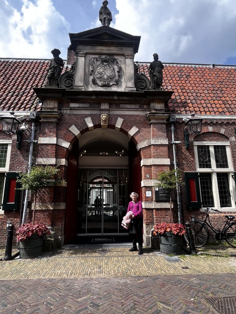
Last Monday we had a mission to accomplish as last summer we had a few spare minutes before checking into ‘Rembrandt and his contemporaries’ exhibition so we spent them strolling around the museum looking for inspiration inside these magnificent walls.

But of course, about Rembrandt, I’ll talk in another post!

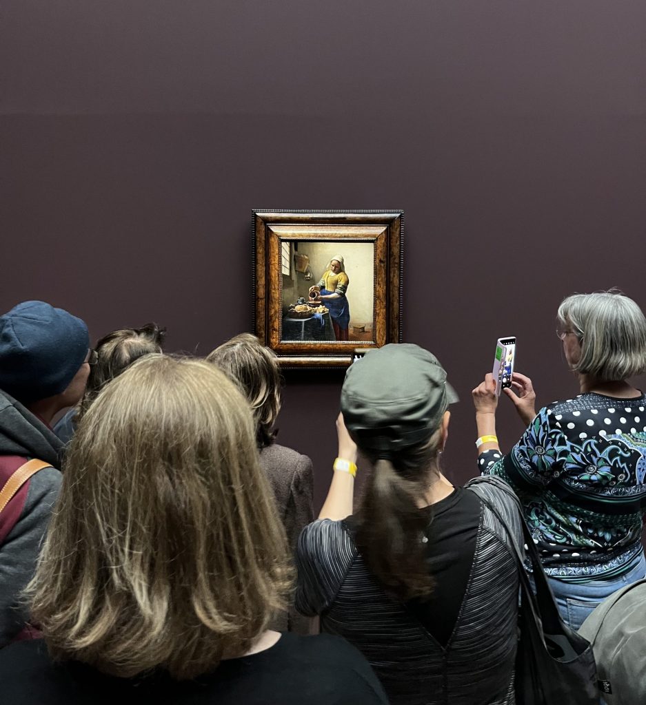
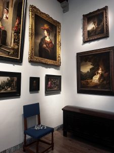
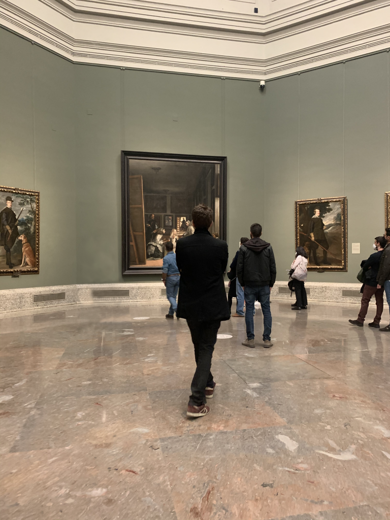
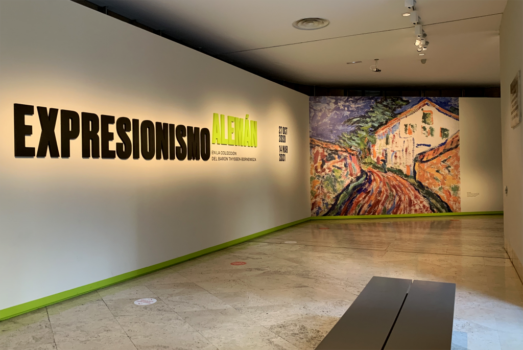
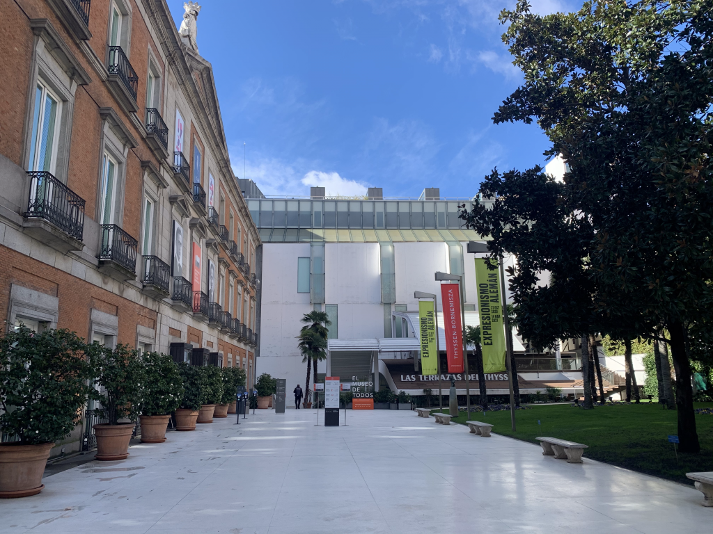
So yes, another Monday, we were eager to learn, investigate and understand art for free thanks to Mastercard which grants free access to the Permanent Collection on Mondays from 12.00 to 16.00. There are usually less people at this time of the day and the ones who are there are really into learning about art history through colourful canvases painted by people we will never get to know.

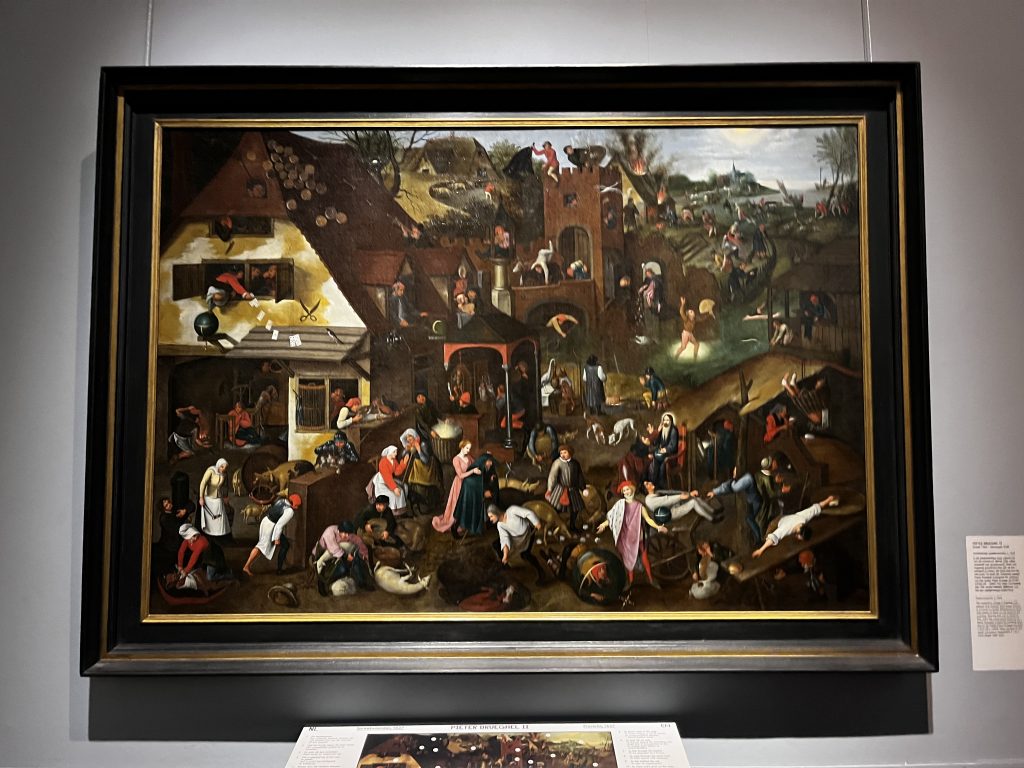
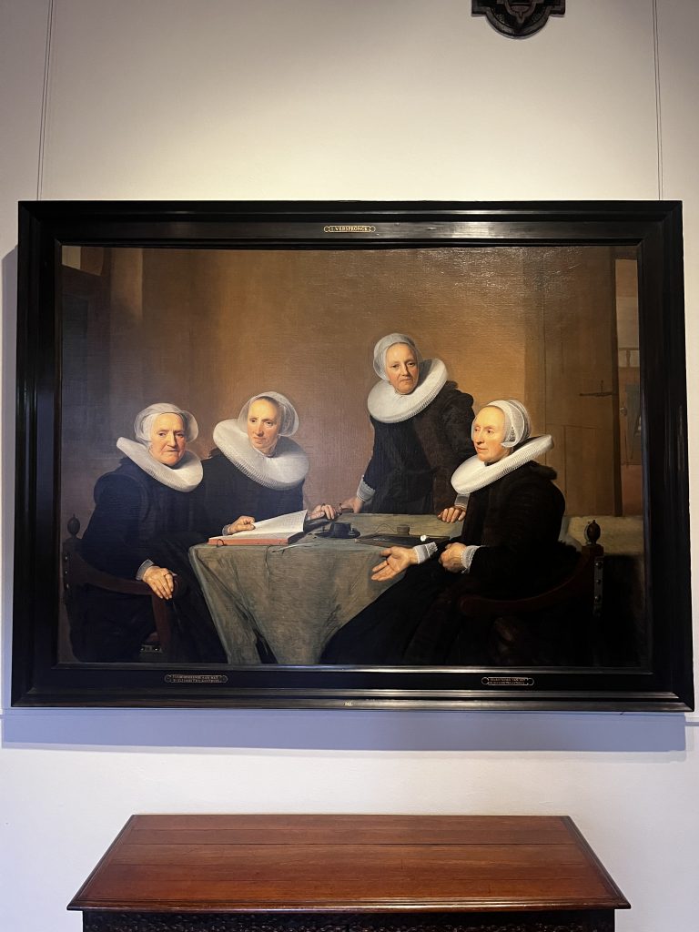
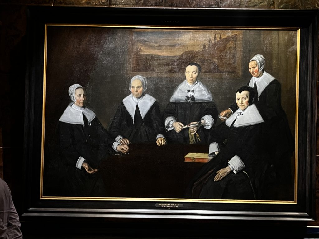
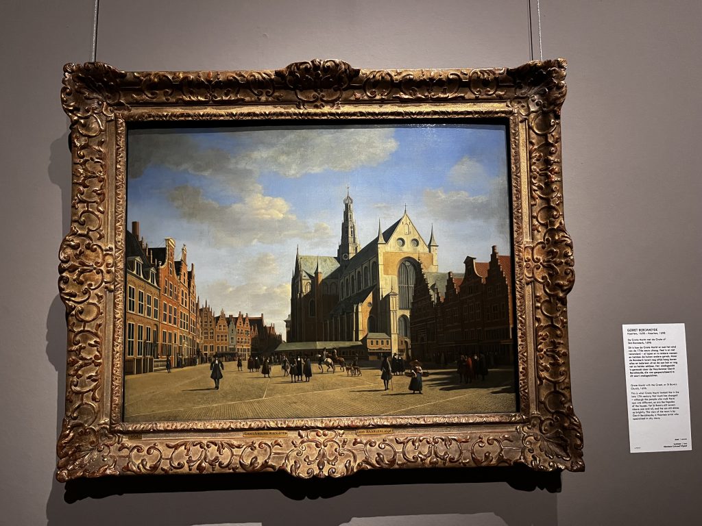
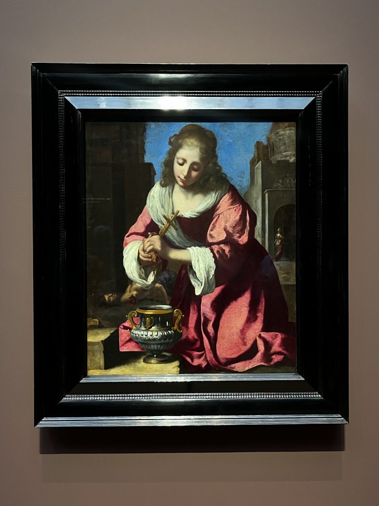
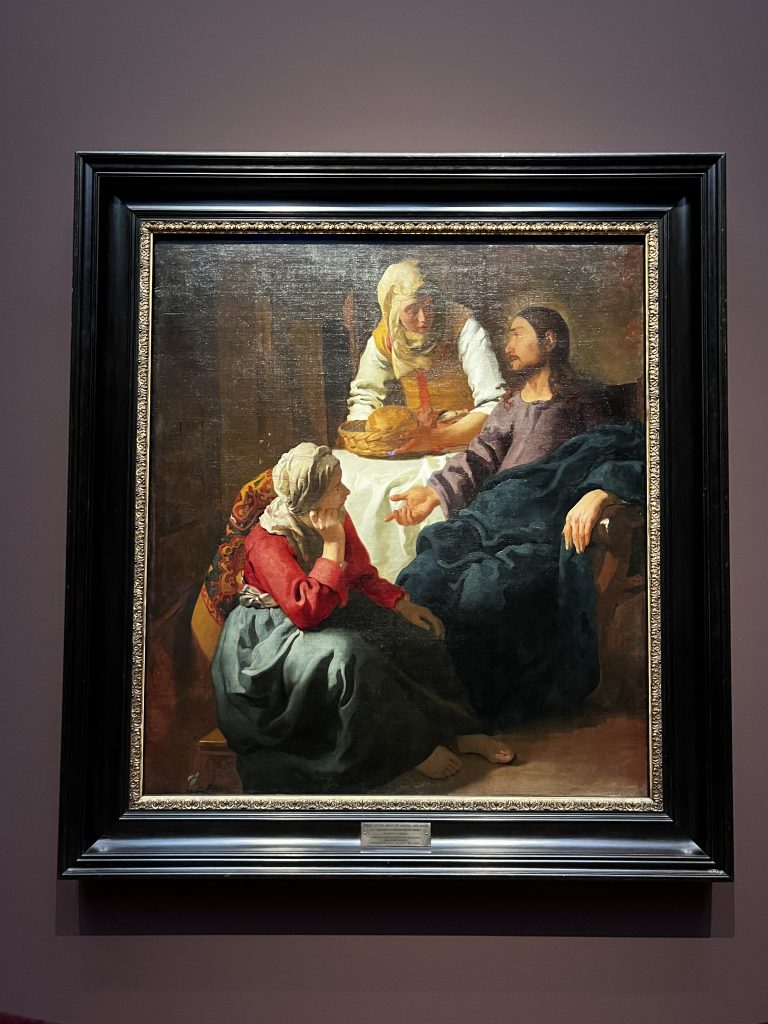
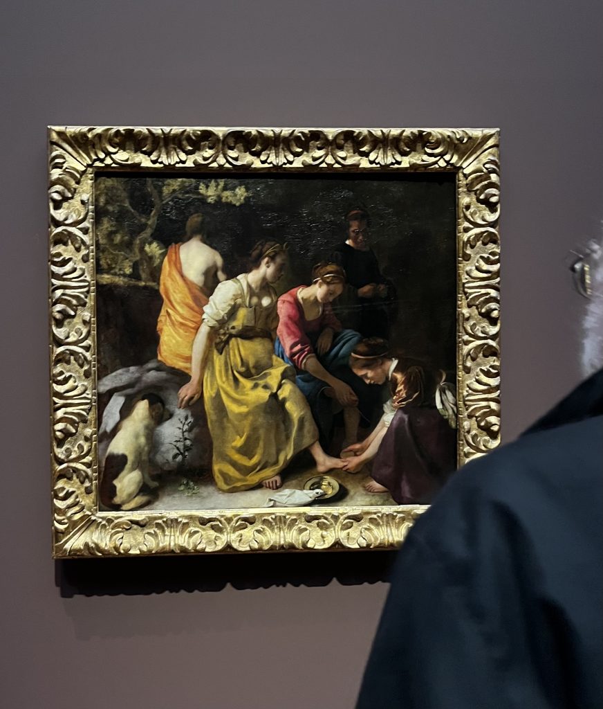
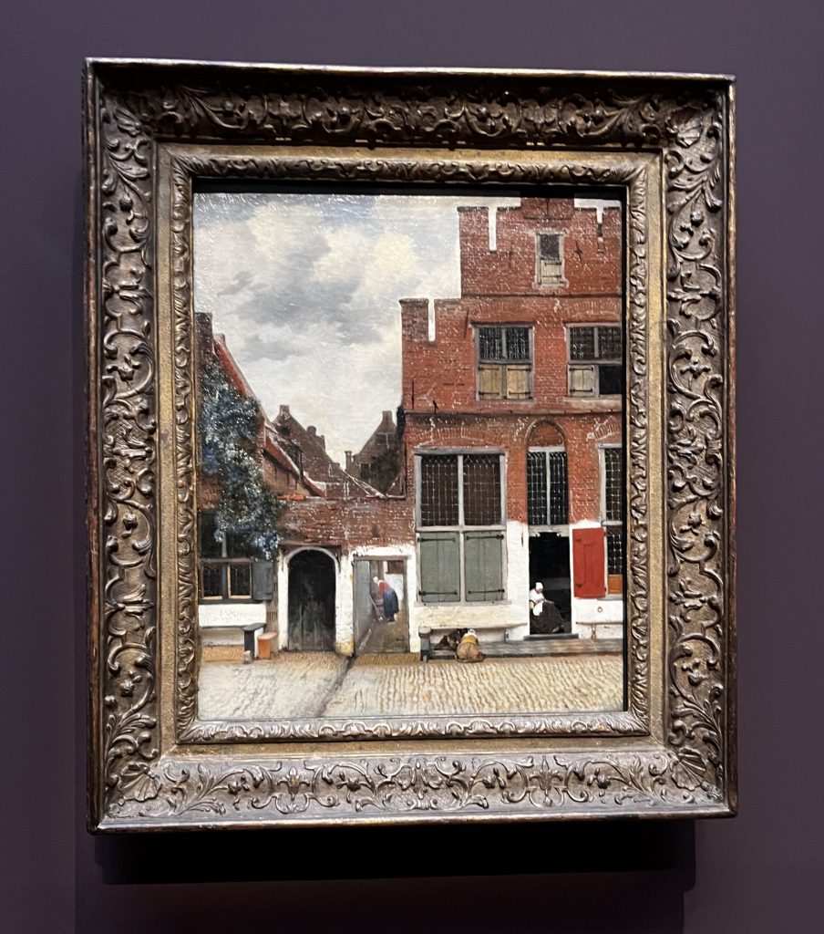
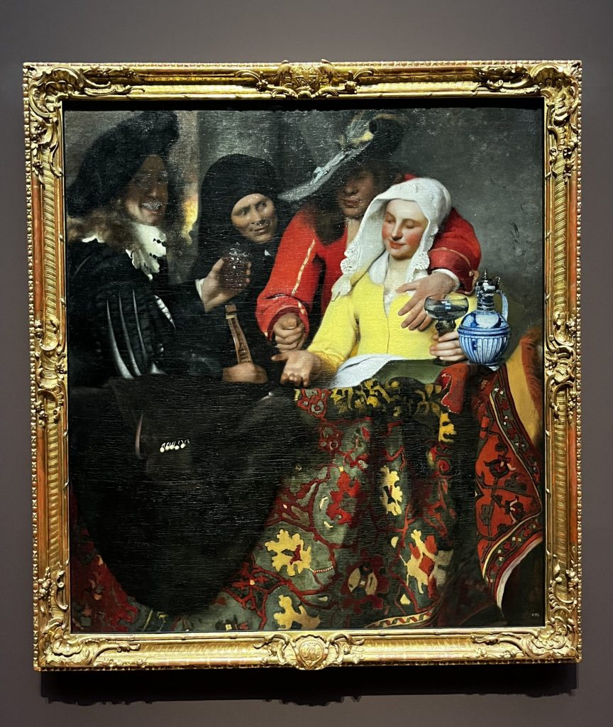
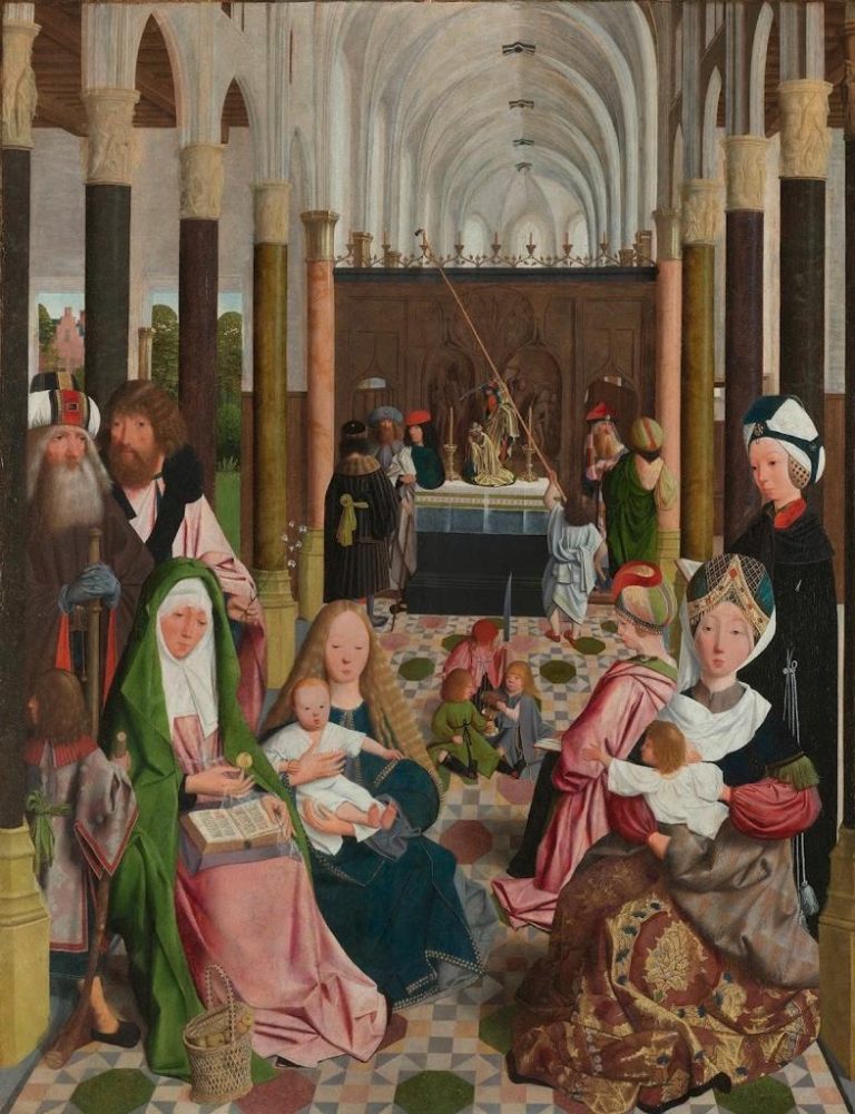
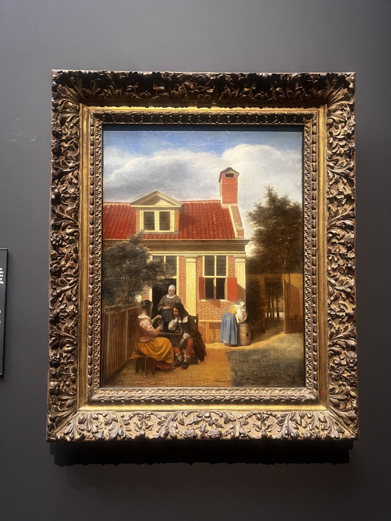
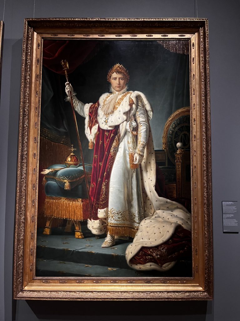
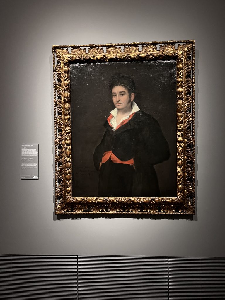
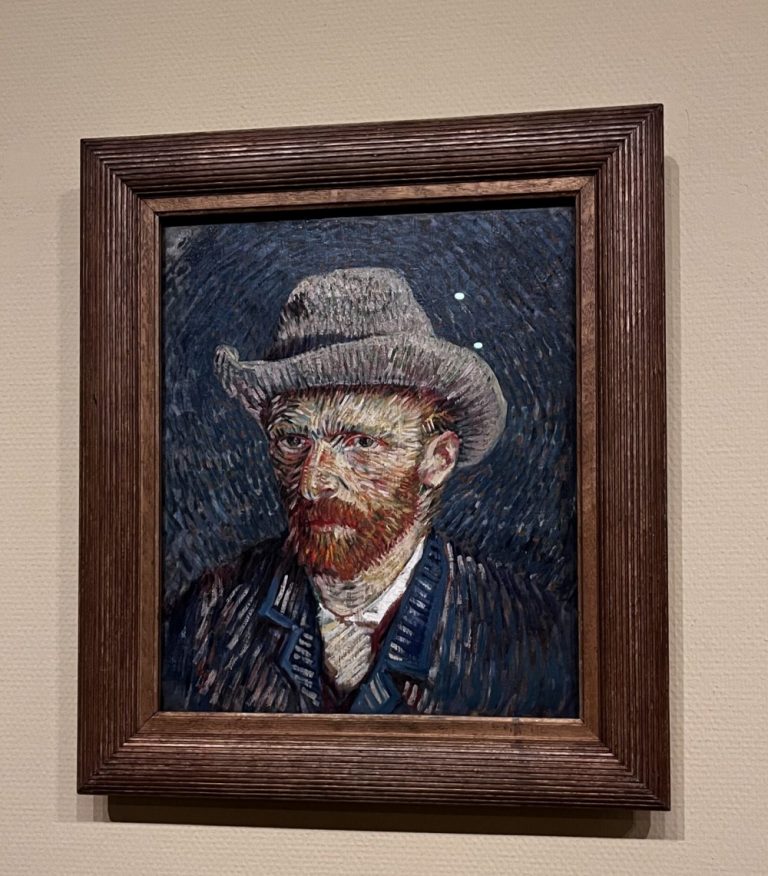
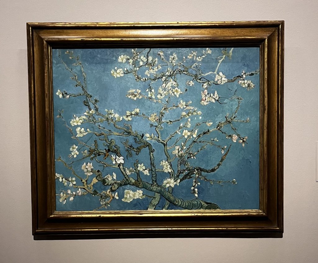
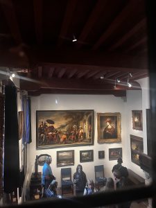
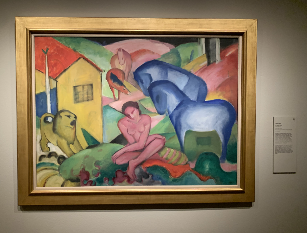
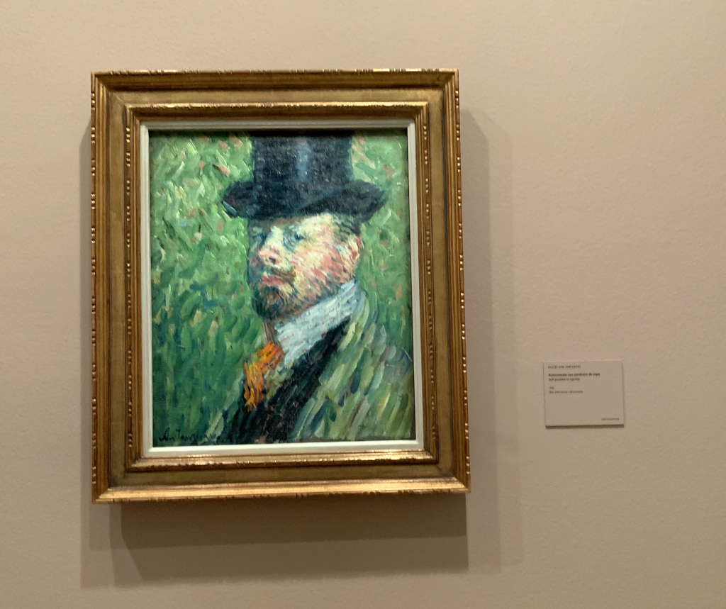
This collection is quite large. It starts with paintings dating from the thirteenth century, all of them based on religious themes as we would expect from an age where sacred or Christian iconography was the only moral standard admissible. Renaissance art, portraits such as The Young Knight in a Landscape painted by Vittore Carpaccio, some of the best Baroque art courtesy of Goya, and several Impressionists like Manet, Monet, or Pissarro are good examples until we reach some masterpieces by Braque, Delaunay or Picasso, which are closer to our times from a compositional or materialistic point of view.

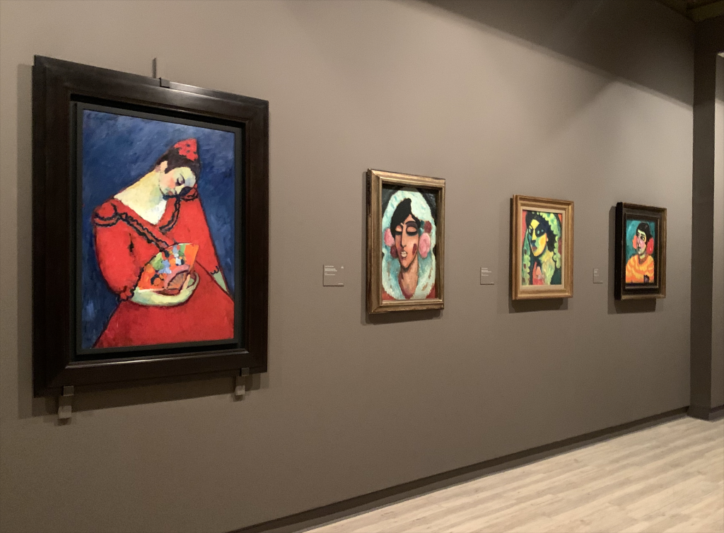
One aspect I would like to mention is that Thyssen dedicates a couple of walls exclusively to women artists such as Georgia O’Keeffe. Although this is quite satisfying, I would like to see more examples not just in a separate wall, but naturally as part of the whole collection. I guess that is something we will have to hope for in the near future.

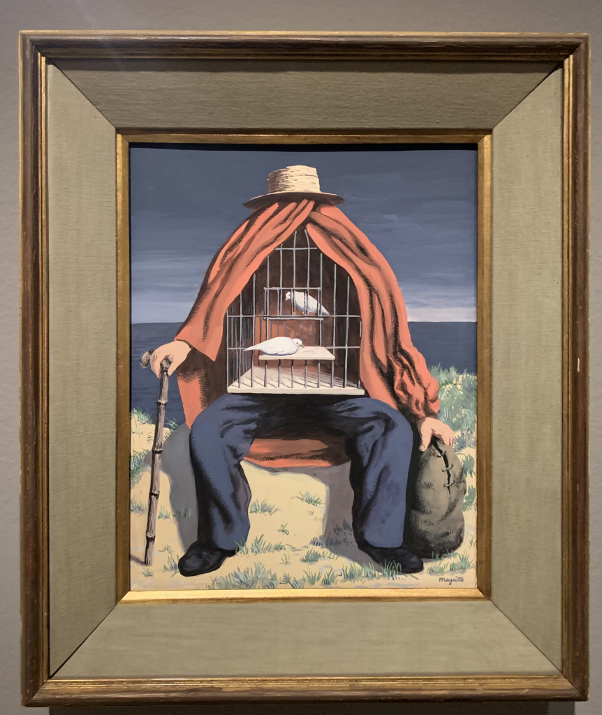
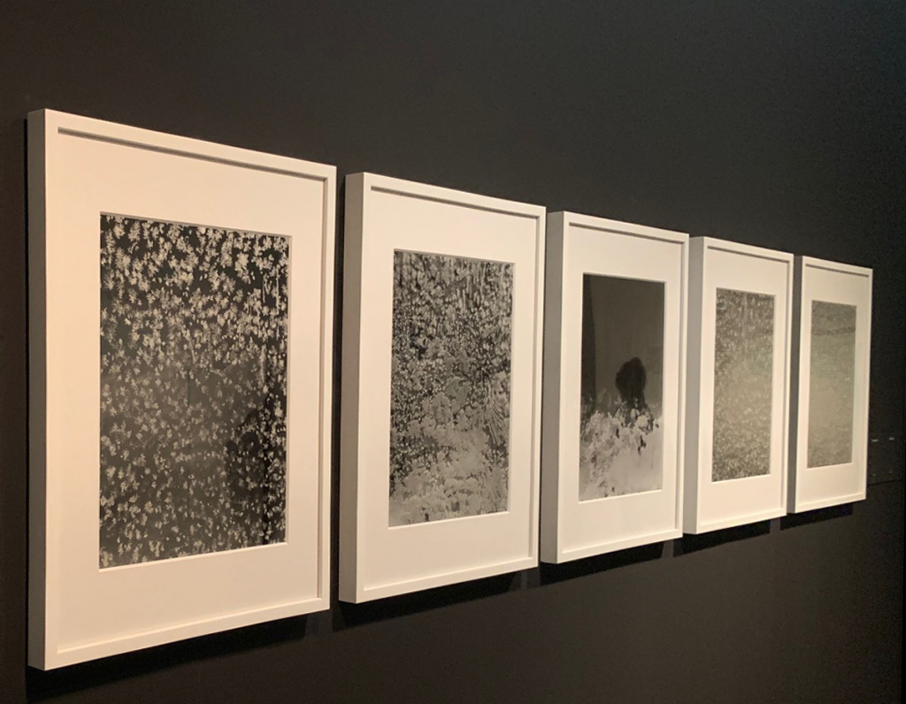
I could continue talking about every single artwork here, making it unexciting for you to visit but I have decided to focus on one of the masterpieces that makes the Thyssen Museum stand for what it is, one of a kind.

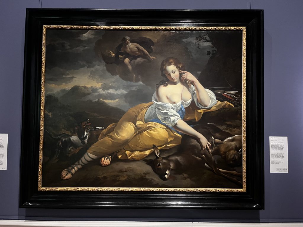
The painting I am going to talk about is quite unique as well, not only for the theme it conveys but for being bolder and more direct than usual.

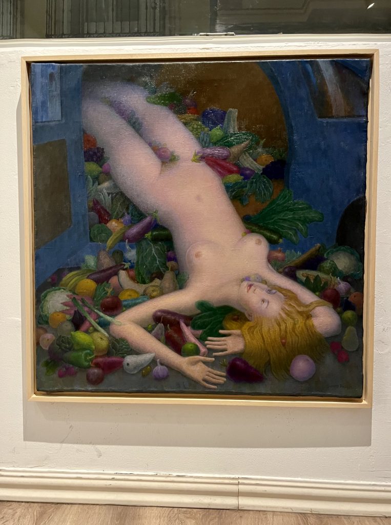
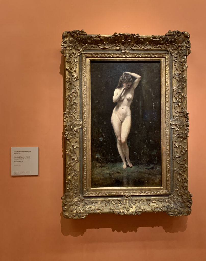
It was painted by Jean Baptiste Camille Corot, best known as Camille Corot and its title is ‘Diana bathing’ or ‘The Fountain’. It seems that Corot painted it during 1869 and 1870 with the help of his disciple, Oudinot.

Corot is popular for painting French countryside landscapes during the XIX century, so I was struck to find an example of the Goddess Diana, a completely nude painting signed by him. But if you focus on his work beyond landscapes, you will find quite a large number of portraits dedicated to women who lived in his rural surroundings, delicate women such as ‘Springtime of life’, along with some 30 other portraits inspired by Diana, and her famous bath time.

So back to the painting that caught my attention. The Goddess Diana really blew my mind because her pose is not what we are used to seeing when painters use this theme.

Corot shows a solitary Diana, no other nymphs are to be seen, whereas other examples of this Goddess during her bath time show her surrounded by women pampering her, holding cloths as towels, combing her hair and of course, some parts of her body would be carefully hidden, but here we can see her whole body.

In this case, her loneliness highlights her sensual figure. She appears to be shy, or perhaps she does not notice that she is being looked at, as if the painter was sneaking into this intimate and private moment. Her pose shows a coy attitude and a subtle grace.

In this case, it seems to be a preliminary study for a bigger painting, and this would be the reason why Diana appears as a sole figure, with no other garments or adornments. Technically speaking, the painting shows a smooth body, respecting the curves and volumes inherent in the feminine form, finely drawn, avoiding hard anatomical lines, a fact that makes the painting beautiful and sublime, without further complexity. 

It was a pleasure for all our senses to be able to walk around and enjoy the gorgeous gem that is the Thyssen Museum. 

PS: The safety measures in place allow social distancing between visitors to the Museum and given the circumstances there were few people that day.

Diana Bathing or The Fountain

Oil on Canvas

72,1x41cm

Painted by Camille Corot.

Carmen Thyssen-Bornemisza collection on loan at the Museo Nacional Thyssen-Bornemisza.

CANAL FOUNDATION

MAGNUM: The Body Observed

Yesterday was an amazing day! We decided to walk all the way up to the Fundacion Canal from Malasaña, reaching our objective after a short  sunny walk, we got to this magnificent art container, at that time of the day when no one is to be seen so you can enjoy everything thoroughly with no rush.

Fundacion Canal is currently holding an exhibition of unique photographic masterpieces, a selection of the best examples in photojournalism, framed under the excellent editorial seal that the Magnum agency has always delivered.

In case you might not know, Magnum is one of the first international photographic agencies, being established in Paris in 1947 by photographers such as Robert Capa on the frontline (He is very well known for capturing lifetime moments like The Spanish Civil war or WWII, enough reasons to be named as one of the most important photographers ever) or Henri Cartier-Bresson, both of them are considered primal references of what we nowadays consider as contemporary photography.

The exhibition talks about the human body as the main concept found and shared amongst fourteen photo journalists that have been selected for us to discover.  A human body that can be sensitive, decadent, an emotional container of feelings, reflection of our own reasoning.

We start this tour with the images shot by Tim Hetherington, another war photo journalist who became a member of Magnum posthumously and whose work depicts the essence of the lonely soldier appearing defenceless in his sleep.

Followed up by master Antoine D’Agata, with his volatile and subtle style of portraying nude bodies which appears to be so personal that can never be mistaken.

What comes next is the mastering of own body, hoping to become whatever we might want to be in the shape of Olivia Arthur’s work. Born in the UK, we are presented with documentary work that she’s shot in India, a country so packed with people that intimacy seems unattainable. She bases the work to be seen here on the Binary concept of human beings, where the word body is linked to being a temple and every possible possibility is an option.

Some others can be seen before we reach the works of the great Philippe Halsman, the king of flying bodies and Cristina Garcia Rodero, who fortunately was my first photography teacher at the University. I’m really fond of her work for obvious reasons, for being one of the first women to step up and succeed in a very male dominated activity, for being humble spite of being famous and for working in collection of pictures that portray the most quirky aspects of Spanish traditions, some of which might remain part of the past.

The life of the actress Joan Crawford seen from the magical lens of Eve Arnold, a woman loaded with talent and determination.

I could unveil the whole exhibition through this post but I think it’s just about time you check these facts by yourselves as the entrance is free of all costs. However, if you can’t go there physically, Fundacion Canal channels a virtual way to visit that can be found on their website.

It’s worth the visit, being able to see real Black and White photographs blown up in an excellent printed quality, as you would expect to see from Magnum. Having the chance to learn some more about human nature thanks to the documentary works of these photographers is something to be grateful for.

COVID security measures are the usual, and there’s enough distance to spare between visitors as the floor marking which aims to prevent people from bumping into each other.

I strongly recommend paying a visit before it ends on the 28th of March!

CAIXA FORUM

OBJECTS OF DESIRE:

Surrealism and Design: 1924-2020

It’s been over a month since we last visited this exhibition but I think that it is worth starting this art blog talking about it due to the lack of understanding surrealism can project but we must understand that there are items that exist with no reason or utility at all.

 These artworks were born out of the irrationality of feelings and some others evoke organic matter with no particular reasoning. This concept is better known as the ‘uninterested play of thought’, a concept that is conceived as playful ideas that unveil new bizarre compositions, different, maybe absurd but they simbolize how the artist’s imagination has no real limits. We find magnificent examples in the works of Marcel Duchamp,  Man Ray,’s iconic photographs or in the kind of crazy pieces painted or designed by Dalí, a daring investigation of the darkest corners of the human brain and the power of imagination. 

 Art as an act of merely copying  is over, in my opinion, the importance of Surrealism lies in the nature of invention, creation as an experiment with any possible outcome.  And then wait for a reaction.. ‘Fantastic’, Don’t you agree?.

And of course, this movement is worthy of a righteous manifesto written by the poet Andre Breton, an ode to imagination, linking the world of dreams with the subconscious part of the mind, aspect that he seemed to share with Freud, and a scientific fact that made this movement become one of the most important social movements of the twentieth century.

 The exhibition is on until the 21st of March so don’t dare miss it!

 P.S: Covidwise, Caixaforum has set security measures that enable the visitor to enjoy the artworks with enough distance and the number of visitors is adequate. I would only advise you to control your giggles as we were told off a few times for that reason ;).